.JPG)
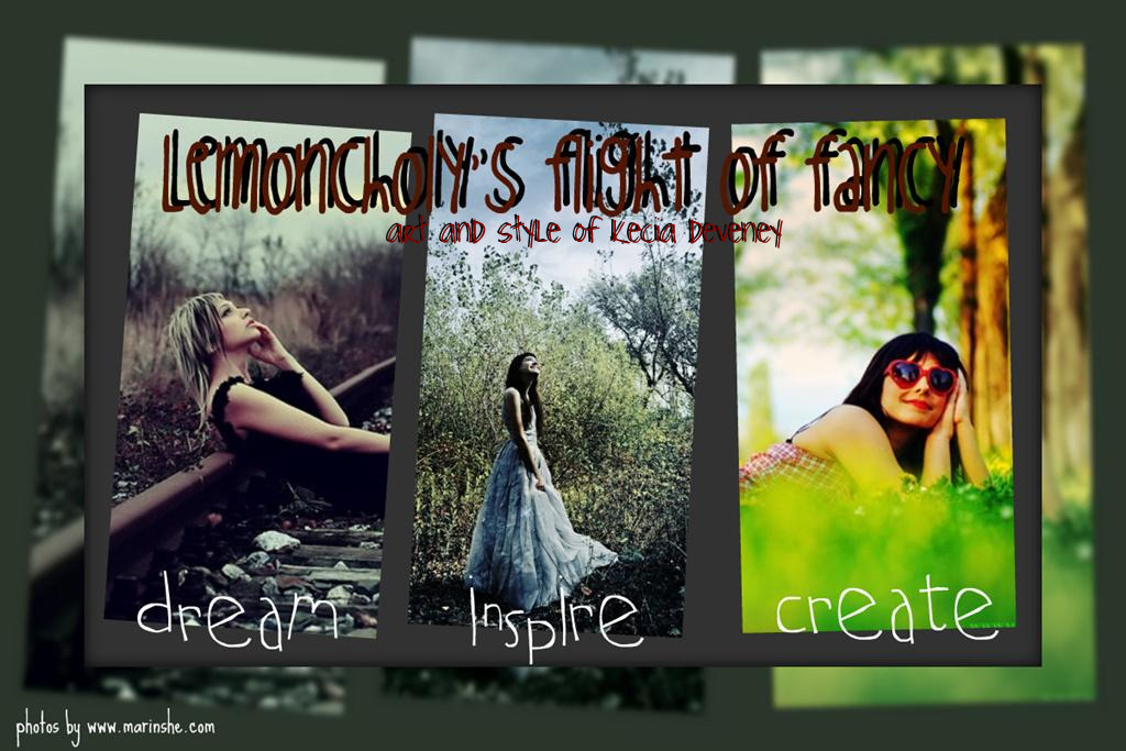
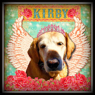
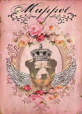
the top picture is the very first icon i did at Artnest. i decided to redo her a bit since i was never quite happy with her. At artnest, i had tried to draw some hair around her using some ink. well that turned into a disaster. i had to wipe it off and it really smudge up the girls face. then i tried to draw in some hair and hated that. (anytime i draw or write, i never like it. by write, i mean add my penmanship to something, because i don't like my writing. it's sloppy and annoying! i think because i find writing tiresome on my hand ( i have tendionitis in both hands). the harder i tried to write neat, my hand gets really tired! that's probably why i like blogging so much - because i can type fast and it looks neater than my writing!
anyway, back to my icon. so i found a copy of the original image i took and decided to rework her a bit. i just think she needed some help! i'm pleased with how she turned out.
we had some fierce winds last night here. trees fell over (not in our yard thank goodness), big branches are all over the roads, my pillars with birdhouses on them were all over, etc. it was that really loud, rattle the house kind of wind.
i slept with tuck last night - me and him squeezed into his bed. i lined pillows against the wall and pressed my back against the wall and then had him laying across the bed and i put one of my legs in front and behind him to prop him up a little (probably dosen't make much sense!). i think he's got a stomach virus. so i stayed with him to help weather him through. he's having a much better day today and i'm ready for a nap!
.jpg)
.JPG)











.jpg)
.jpg)


.jpg)


Your icons are magical. I love the attention to detail. Hope that stomach bug high tails it soon.
ReplyDeleteKarla
i love your icons, anahata is such the great teacher!! nothing like the love of mom to help make a child feel better.....
ReplyDeletexo
Really enjoying your icons. Thanks for sharing them!
ReplyDeleteWondered how you fared with the storm last night. I was stranded briefly at home until the fallen trees were cleared from the roadway.
i love them both!!! they're like 2 different moods, the top one is a bit darker, more serious, thoughtful, while the bottom is lighter, brighter, more whimsical, but both equally amazing!
ReplyDeletexoxo
layla
p.s. i feel the same way about my handwriting, every time i sign the back of one of my prints, i'm like, eewwwww, i wish i had one those "cool" signatures :D
I like both versions.
ReplyDeleteJoanne
I think those icons are right up your alley ~ Its obvious that you have a talent for creating them!
ReplyDeleteJean
charmdimsur.etsy.com
hi Kecia,
ReplyDeleteYour art is getting better and better I love these new pieces you've created.
I hope you got the glitter box by now.
Terri
Kecia, I LOVE both of your pictures, we are so critical of ourselves aren't we? But I love it, hope your little one is feeling better soon, got em' in my prayers. Creatively, Tammie Moore
ReplyDeleteWow! Totally different look! I like them both. It's like images of sisters, one light and one dark :)
ReplyDelete